1. Art Director
2. Designer
3. -
2. Designer
3. -
Cubs Marquee Network
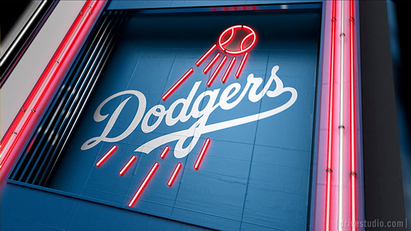
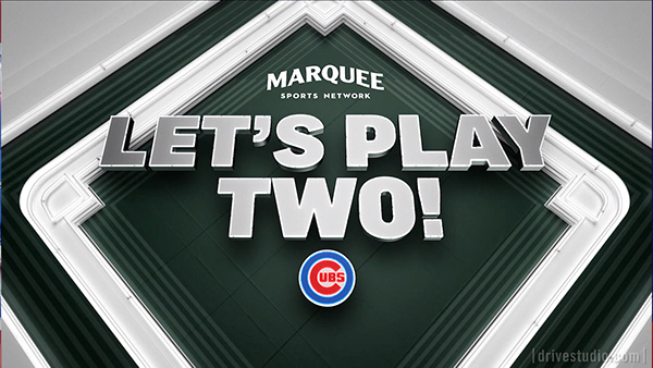
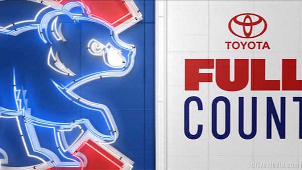
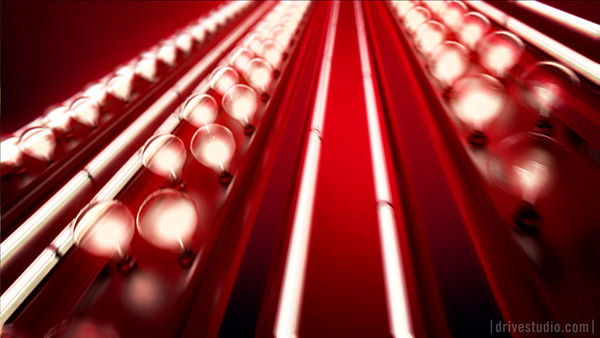
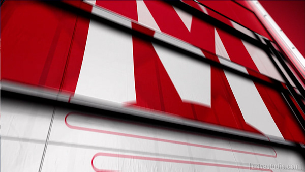
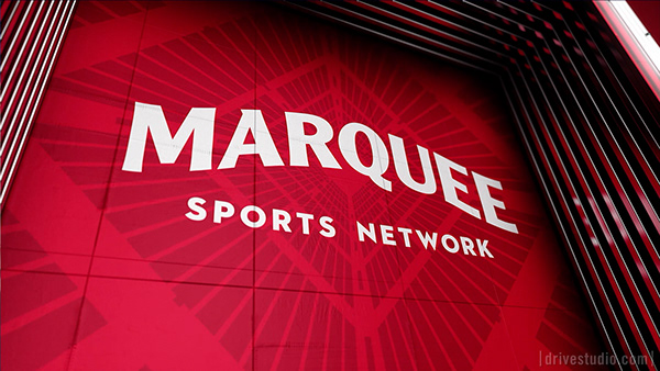
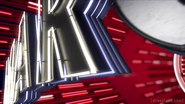
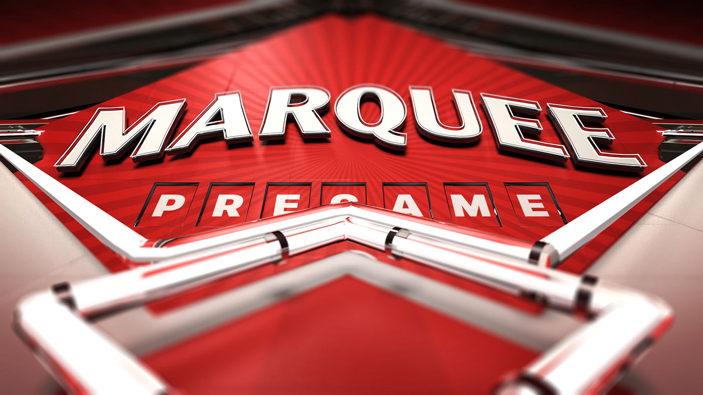
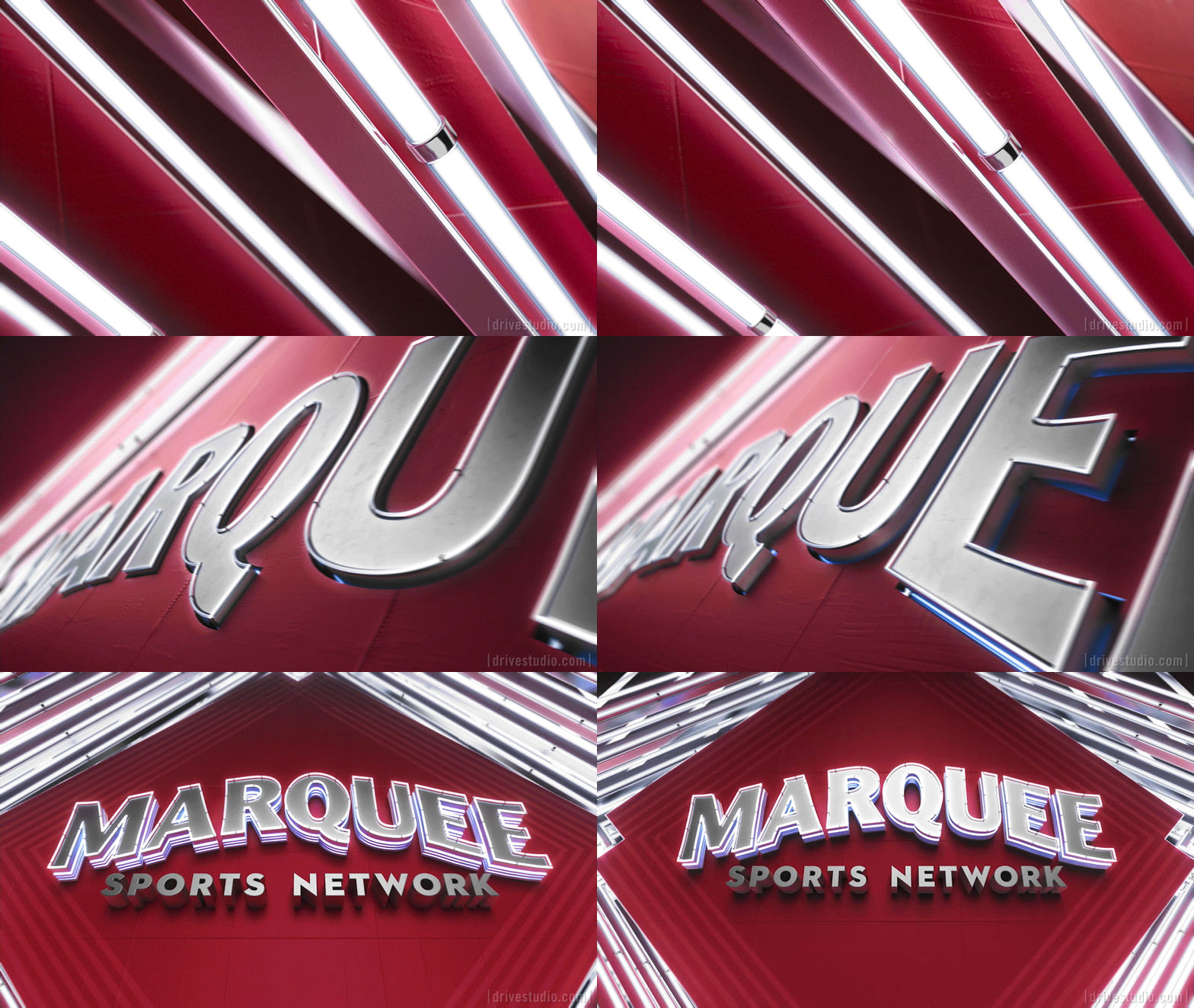
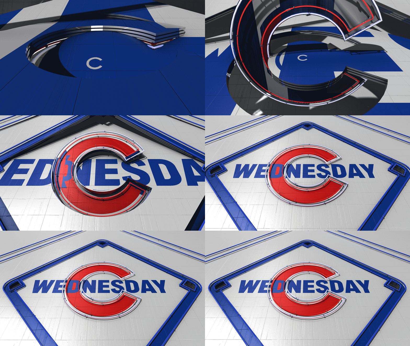
I teamed up with my friends at Drive Studio to art direct the Marquee Sports Network package. In our initial briefing, Drive had developed a Chicago lights concept, inspired by the art deco and neon signage commonly visible throughout the city. One of the most familiar icons in the city of Chicago is the red marquee, hanging outside Wrigley Field. My role was to use this inspiration as a springboard to further develop the visual relationships between the city, team and network.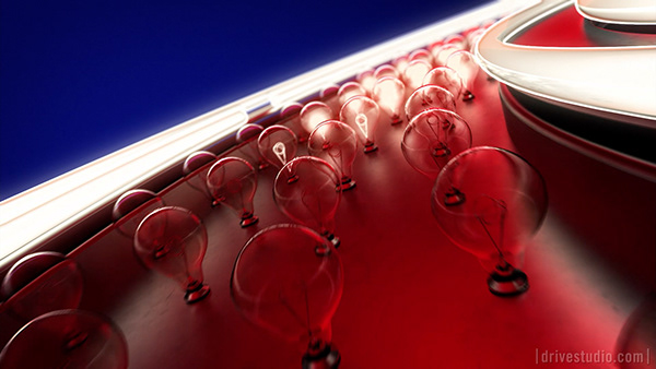









Development
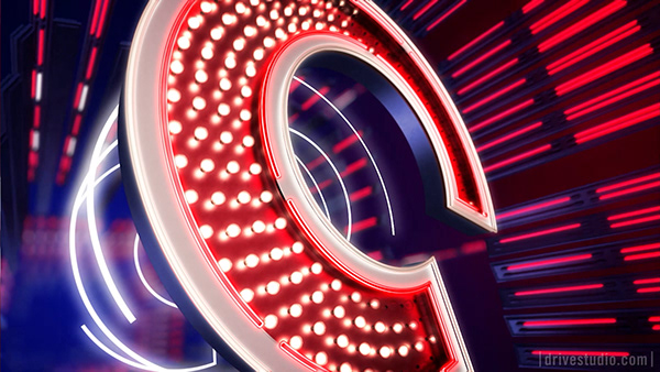
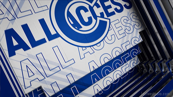
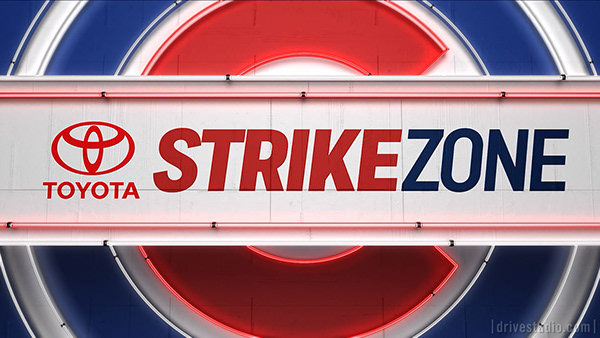
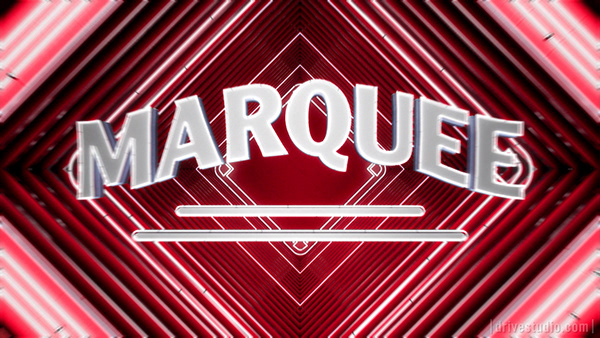
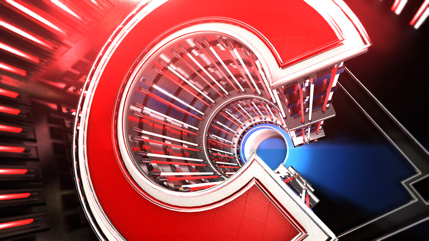
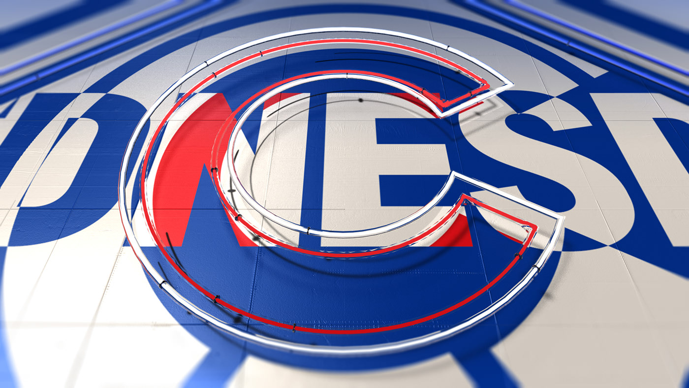
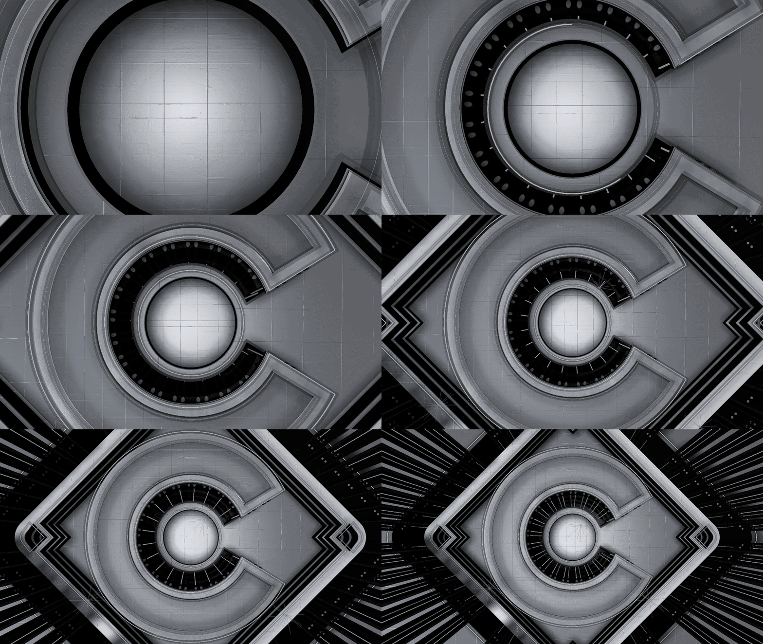
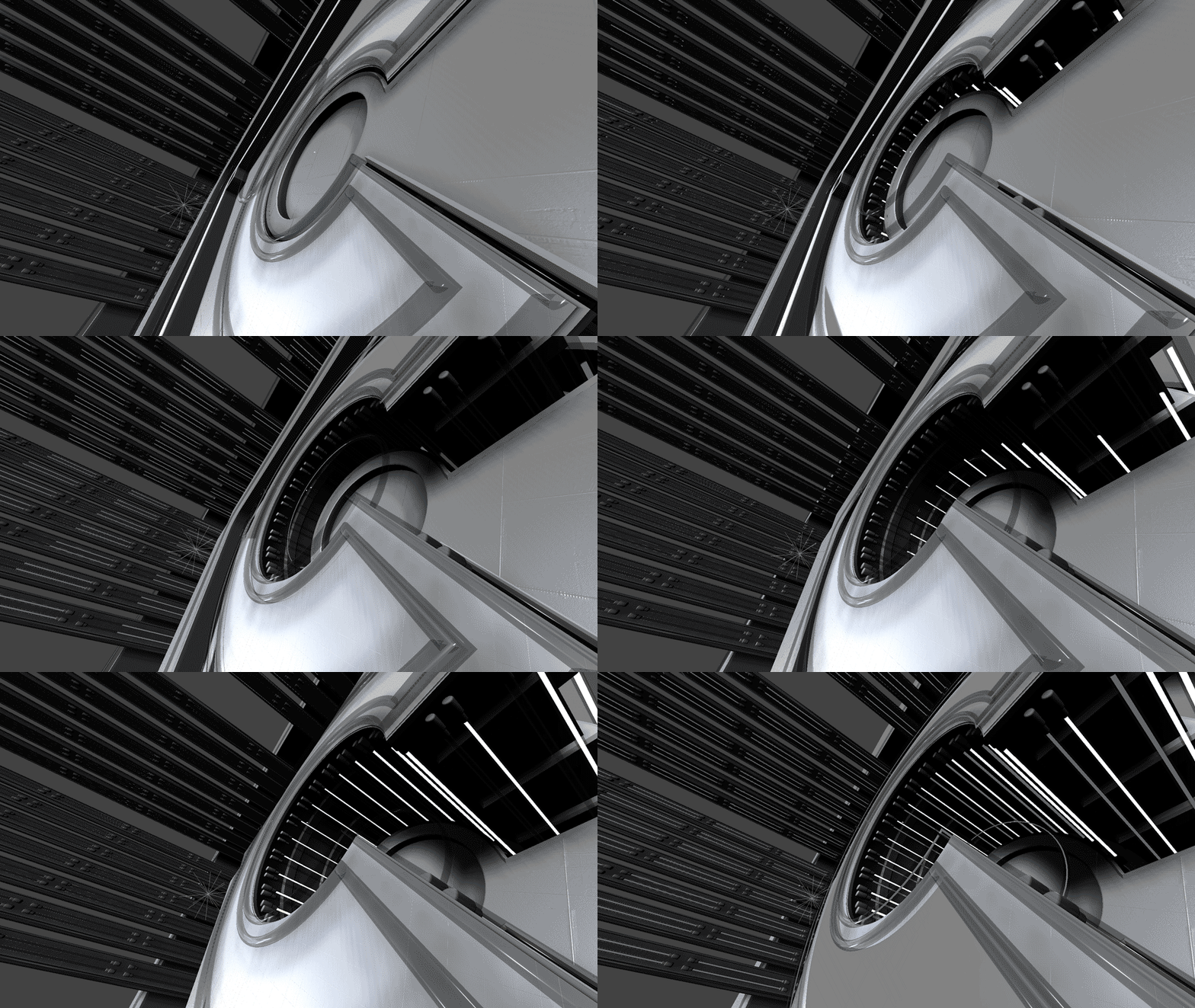
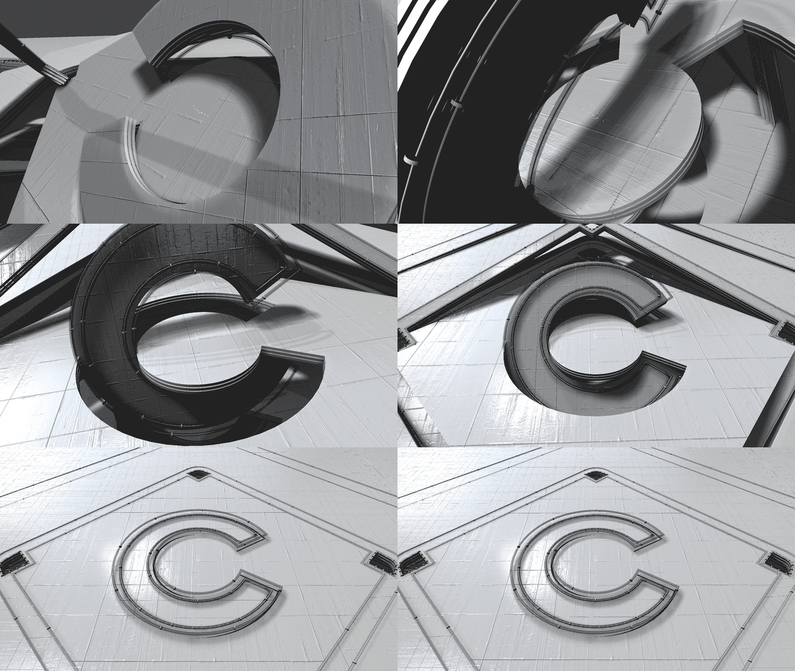
The development of different spaces and environments was inspired by the art deco architextrue common throughout the city. Using this inspiration, we expnaded it out into a 3d environment. Also inspirational was the Chicago Cubs “C,” which provided a radial and symmetrical composition. The baseball diamond itself was another simple shape, but an iconic shape that not only spoke to the city and the team, but also to the sport of baseball.






Exploration
In the beginning, we did a lot of research on the city itself, the architecture that represents Chicago, and the inspirational neon signage thatcan be seen in the loop. We condensded it down to a couple of different two dimensional shapes that were used as a cornerstone to represent the package, city and team all in one.

Credits
Creative Director Nick DiNapoli EP / TD Marco Bacich Producer Patty Kiley Art Director Tom Green Designer / Animators / Mike Croxton / Gary Koopsen / Zach Sadler / Brian Hwang / Daesun Hwang / Nate Samanns / Matt Green / Alec Vitale / Nate Sjogren / Trent Bailey / Tyler Joint